Pocketful: Landing Page Redesign
Redesigning the Pocketful Landing Page to reflect the company’s mission and values
Visual Designer
Michael Elizarraraz (Product Designer)
Context and Goal
The design team was tasked with redesigning the landing page for Pocketful, a startup focused on helping young companies grow through branding services and AI-powered tools.
The primary goal was to improve user engagement, clearly communicate value propositions, and support business development.
Problem
At this point in time, Pocketful did not have a centralized hub for promoting the company’s innovative features and showcasing trustworthiness to our users. Additionally, there was a lack for other ways of educating prospective clients on our suite of features besides door-to-door sales and product demos.
Audience
The Pocketful homepage serves prospective customers: small and growing businesses in South America exploring tools to manage branding and scale operations. These are founders and operators who may be encountering Pocketful for the first time, often after a door-to-door sales interaction or a referral, and need to quickly understand what the platform offers and why it’s trustworthy.
Secondary visitors include potential investors and partners looking for signals of growth, innovation, and market fit: they need to see the company’s vision and traction clearly communicated without having to dig.
The homepage needed to serve both audiences in a single scroll: converting the unfamiliar visitor into a demo request, while giving the more informed visitor enough substance to feel confident in the company’s direction.
My Role: UX Designer
As a UX designer for this project, I was tasked with redesigning the Homepage for Pocketful in collaboration with the second designer on our team. My responsibilities included wireframing, prototyping, user testing on a strict deadline and co-creating a design system for the brand.
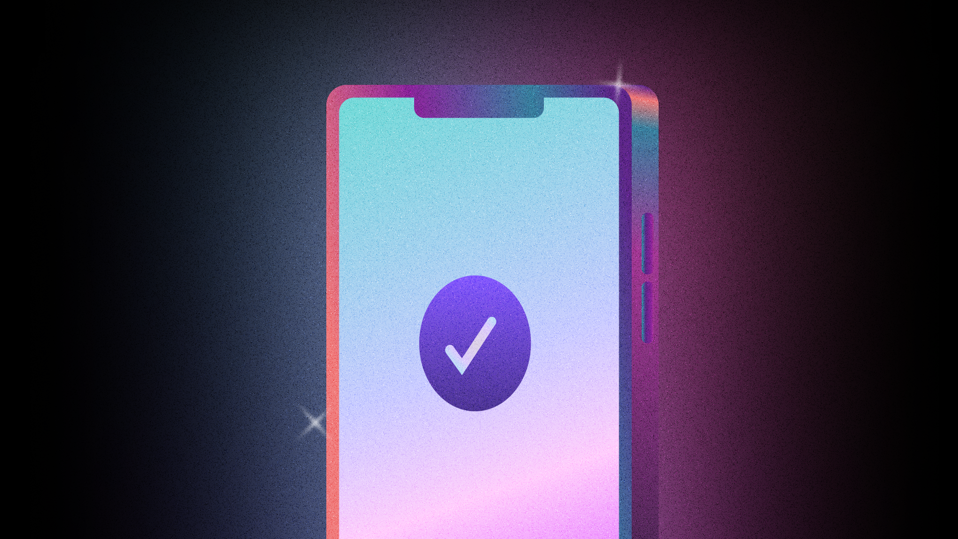
Homepage Before
Homepage After
Competitive Analysis
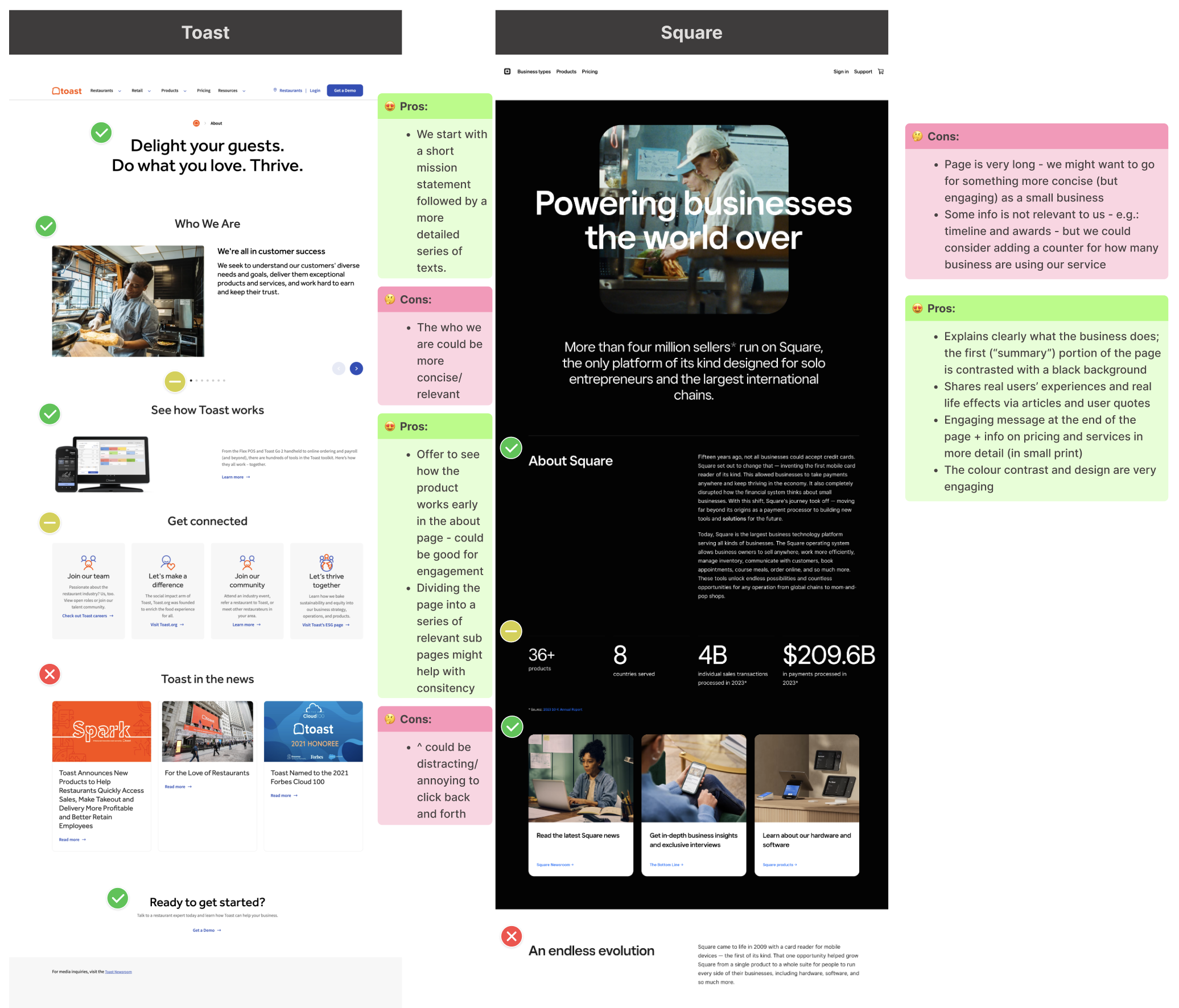
Direct Competitor: Toast
A leading payments solution, Toast offers all-in-one business management tools aimed at small businesses. They provide payment processing, analytics, and customer engagement tools. The strengths of the company include strong user adoption and a high level of integration for physical retailers, which are values that Pocketful could also highlight. Their visual language is less strong; it may get confusing navigating the page and the branding is not memorable.
Direct Competitor: Square
Square is amongst the most established fintech platforms for small and growing businesses. The company offers payment processing, inventory, and payroll tracking products. According to users, Square’s diverse products are also easy to use, which is a value that Pocketful holds as well. Their visual design is also very tech-oriented and while being minimal manages to maintain uniqueness to the brand.
Graphic Style Ideation
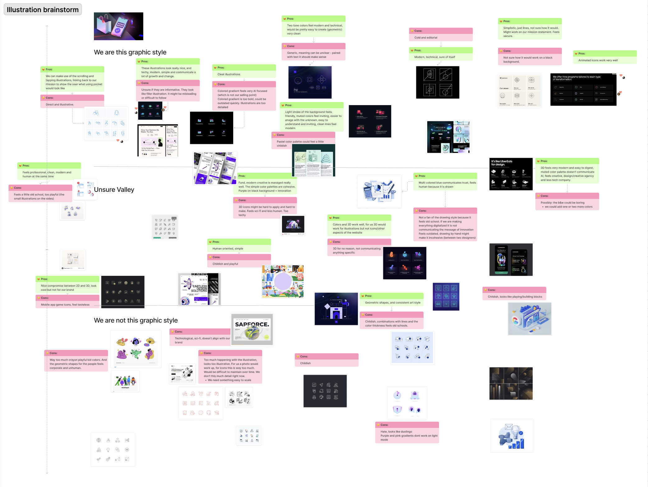
Visual language
We aimed to formulate a functional and minimal visual language that communicated both tech-focused and human-centred graphic style. We were able to achieve this by emphasising a clean, modern and professional style, incorporating subtle gradients and geometry.
Ideation and Key Flows
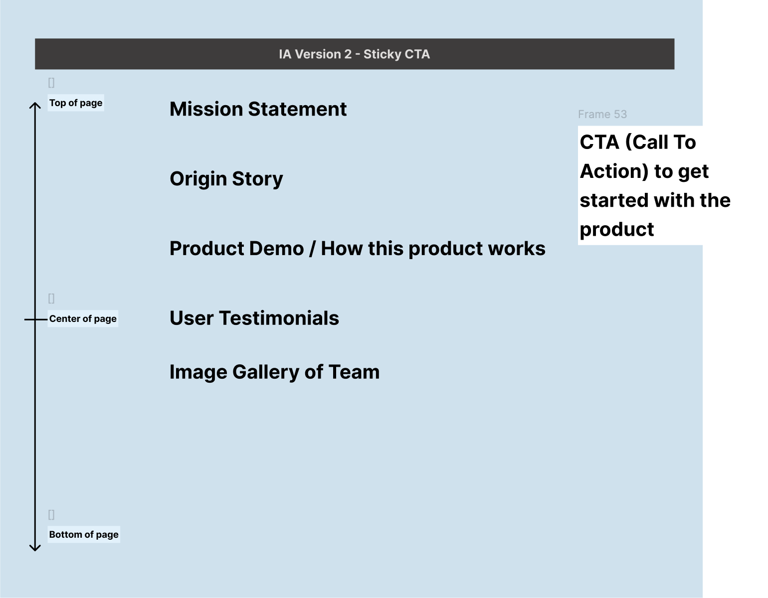
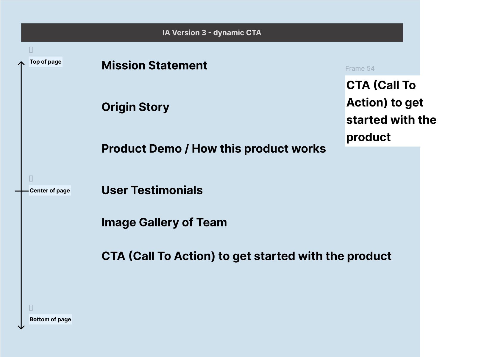
Information Architecture Iterations
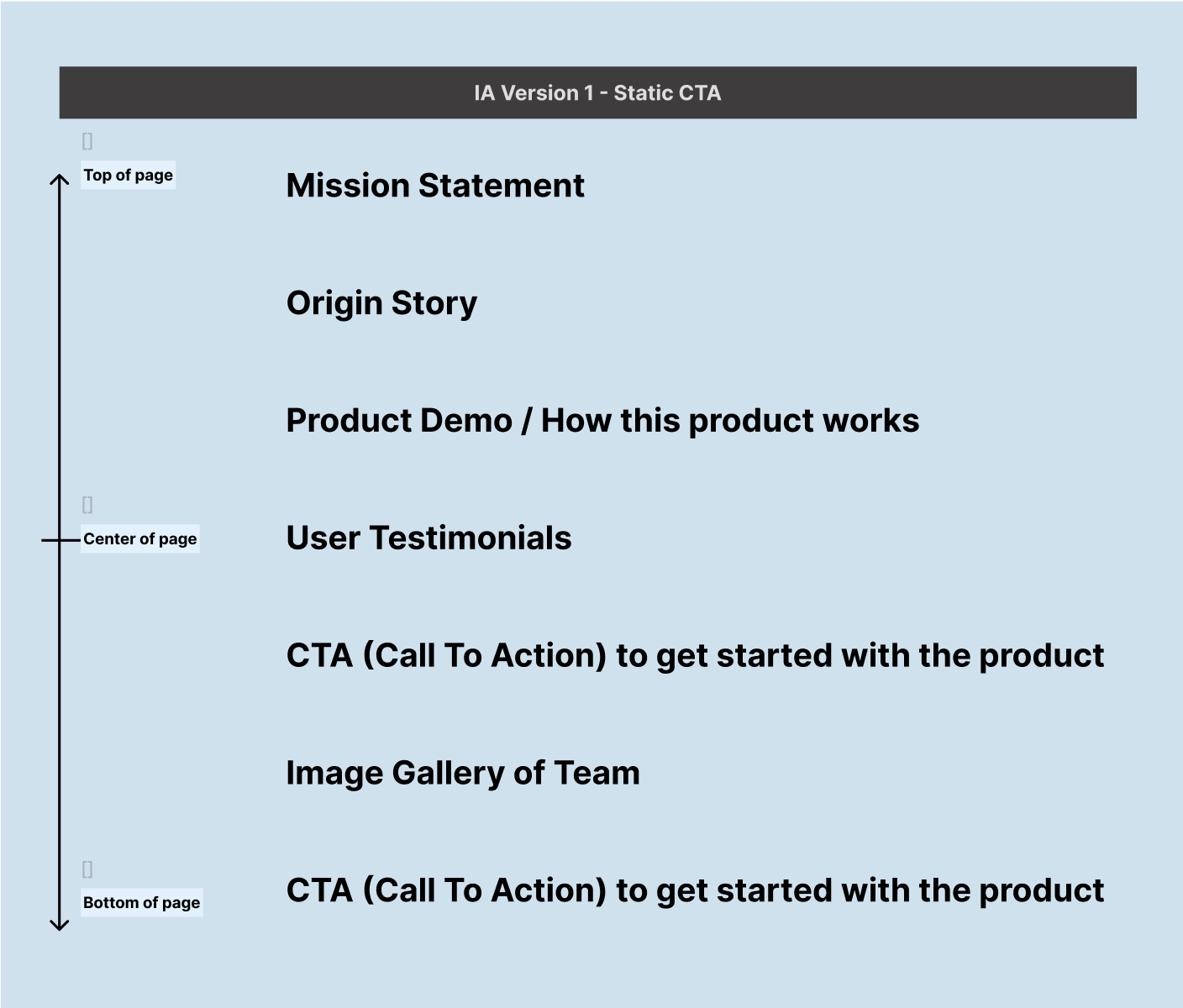
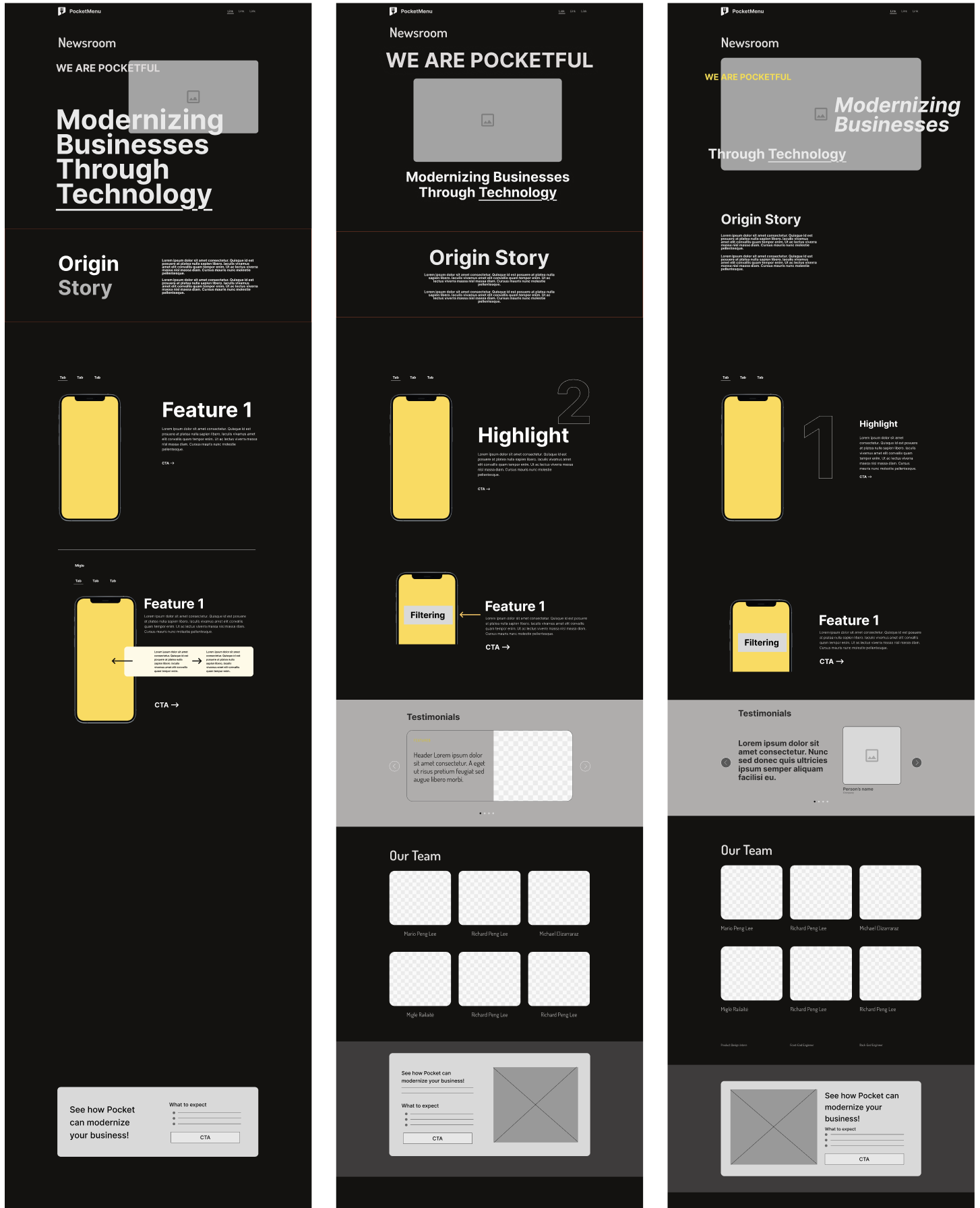
Low-fidelity designs
We reached a decision to represent the two main products offered by the company via a GIF demonstrating how the client would be interacting with the digital product. Additionally, we landed on a decision to include a CTA at the bottom of the page; this way, the user’s experience would not be interrupted by a CTA while they are getting familiar with the company, and instead would be invited to find out more after they have read all of the available information.
Design Development and Solutions
Challenge
After finalising and presenting the initial information architecture decisions and design to the team, we were faced with a new challenge - the company had multiplied the number of products and services provided, which meant that we would now have to show not two, but eight types of services that the client can choose from.
Solution
Our solution was to represent the new categories of services provided by the company with animated icons, and direct the potential clients to contact us for a demo or customised set of products they would prefer.
Initial Iteration
Final Design
Impact
Project Successes
- Improved perception of the brand by new users - 9 new clients landed within the first four months of publishing
- Design met the brand guidelines and current design trends, this way highlighting the business’ forward-thinking values and drive for innovation
Reflections
It was challenging and interesting to learn about the design practices in South American. User research possibilities were limited due to time constraints, which meant that I had to be resourceful and reach out to South American designer colleagues for guidance, as well as in-depth secondary research in the field to guide my design decisions.
The main challenge was creating a consistent visual language for the company, including the unexpectedly arising need for graphic animated elements to accommodate and emphasise the many services offered at Pocket, which we had not accounted time for. Strong skills of teamwork and communication we had developed with the second product designer and our creative director led to a huge success in this area. Thanks to the challenge we created reusable elements for the company with a unique and innovative brand and visual language.