Pocketful: Newsroom Redesign
Designing the Newsroom for the Pocketful website to showcase financial and product feature updates
Visual Designer

Context and Goal
Create a Newsroom that allows us to easily update our prospective customers and clients of Pocketful’s feature updates while building trust.
Problem
At this point in time, Pocketful did not have a centralized hub for promoting the company’s innovative features and showcasing trustworthiness to our users. Additionally, there was a lack for another way of educating prospective clients on our suite of features besides door-to-door sales and product landing page.
Audience
The newsroom’s primary user for prospective customers and clients of Pocketful to get a glimpse into the suite of features that we offer to help scale their business.
The secondary users, Investors and Partners, are able to read compelling narratives of success and see reliable financial updates and growth strategies.
Tertiary Users are general audiences who want to learn about the company’s values and learn how to use Pocketful’s features - people wanting tutorials, best practices.
My Role: UX Designer
As a UX&UI designer for this project, I was responsible for the end-to-end design of the newsroom feature, as part of which I led the competitive analysis, designed user flows, created wireframes, and final UI for the newsroom redesign. I also collaborated on defining content strategy and interaction patterns and validated solutions with stakeholders.
Competitive Analysis
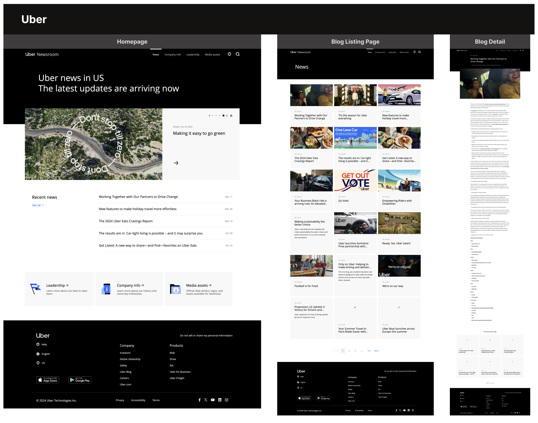
Indirect Competitor: Uber Newsroom
We referenced Uber Newsroom as an indirect competitor. Uber Newsroom is consistent with the brand’s visual language and displays articles clearly. The site is easy to navigate, although the article display can be hard to follow as it is displayed in one continuous block of text.
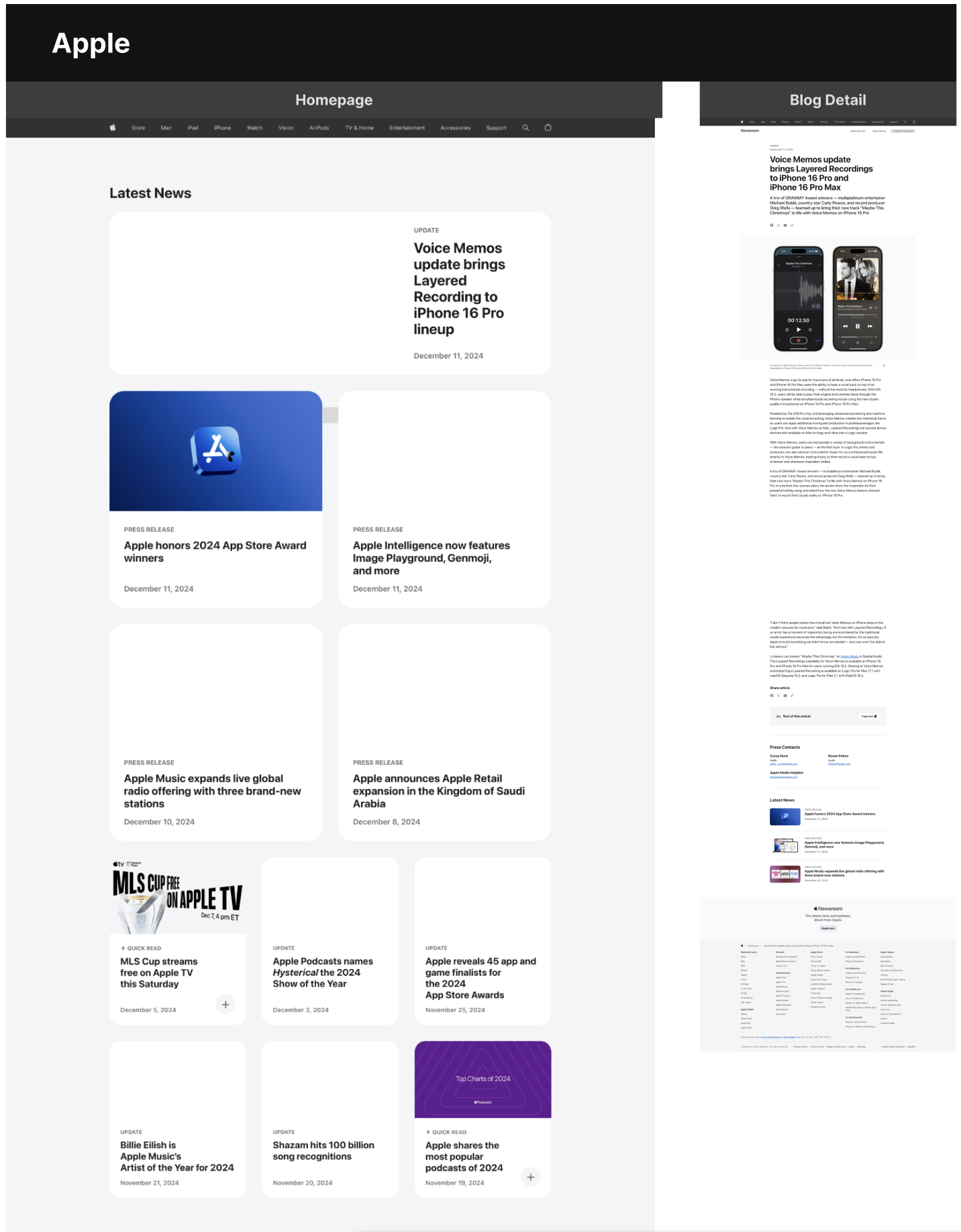
Indirect Competitor: Apple Newsroom
Another competitor we analysed was Apple Newsroom. Apple Newsroom design aligned with our priorities and vision much more - on top of being consistent with the brand’s strong visual language and providing a smooth user experience, the design is tech-oriented and clean. The Newsroom site is easy to navigate and article display page maintained simplicity and clarity while organising the text in a manner that simplifies the reading experience for the user.
User Needs and Wants
Specific user needs and wants
Need: Quick access to press materials and facts.
Want: High-quality multimedia assets and spokesperson contact information.
Need: Assurance that the company is reputable and innovative.
Want: Stories showcasing products, services, or community involvement.
Need: Insight into company culture and stability.
Want: Positive stories about workplace initiatives, diversity, and inclusion efforts.
Need: Reliable financial updates and growth strategies.
Want: Compelling narratives of success and market leadership.
Need: Information about company values and societal impact. Learn how to use the Pocket
Want: Engaging content about sustainability, philanthropy, and innovation.
Key Features That Address User Needs
Highlight official announcements and developments.
Provide downloadable assets like logos, images, and videos.
Direct access to PR and media representatives.
Organise past news and updates for ease of use.
Extend reach and interactivity.
Written Content
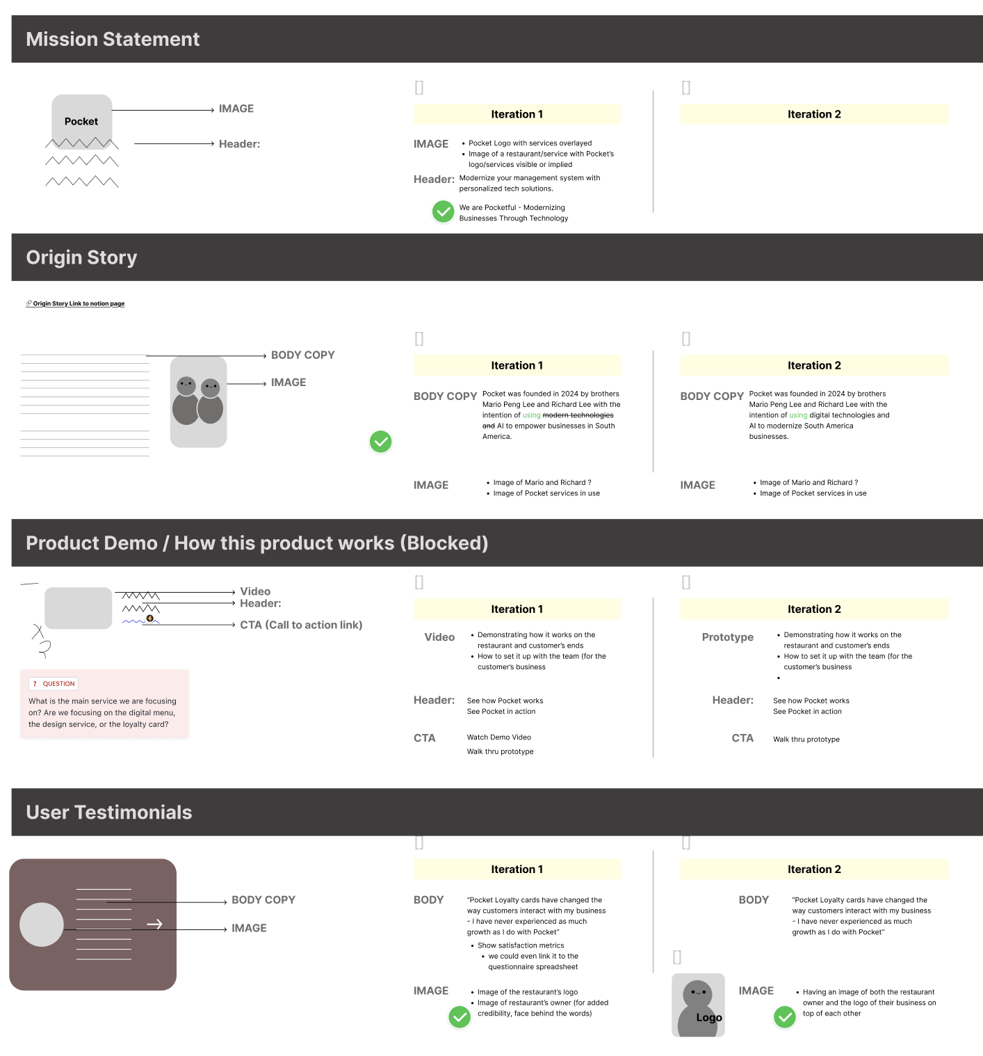
Iterations of written content
We aimed to construct clear, user-centric written content for headlines, article summaries, CTAs, and navigation. We established a clear and consistent tone of voice that aligns with the Pocketful brand, inspiring trust and reliability, and standardised labels and button texts to improve navigation and usability.
Design Development and Solutions
Challenge
A major challenge faced during this project was directing the user from the newsroom and article pages to inquire about the products and services that Pocketful offers using a call to action (CTA) prompt, without breaking the flow of their reading experience.
Solution
Our solution was to include two types of CTAs on the page - one at the bottom of every page, and one as sticky scroll, following the user on the right hand side of their screen. On the mobile version of the site the CTA can be seen as a small message that the user clicks on to view the CTA and access the inquiry form, and on desktop view the full message follows the user as they are browsing with the full information displayed.
Newsroom Homepage on Mobile
Article discussing one of the core features offered by Pocketful, digital loyalty cards, on the newsroom page. The CTA can be seen on the right hand side of the screen.
Impact
Project Successes
- Improved perception of the brand by new users - 7 new clients landed within the first four months of publishing the feature.
- Articles and news on company products are being published consistently, collaborations celebrated and client achievements highlighted. This has led to strengthened relationships with current clients, resulting in more and continued projects and collaborations.
Reflections
As we worked hard to develop a clear visual identity for the brand, we were able to continue on the same visual path with this project. The main challenge was creating a newsroom that is both visually appealing and highly functional for a diverse set of users.